
Minimalist, philosophical visuals — designed to think.
NoirPrint blends visual irony with classical typography. Each piece is a small act of resistance to empty aesthetics — a reminder that walls can hold ideas, not just decoration.
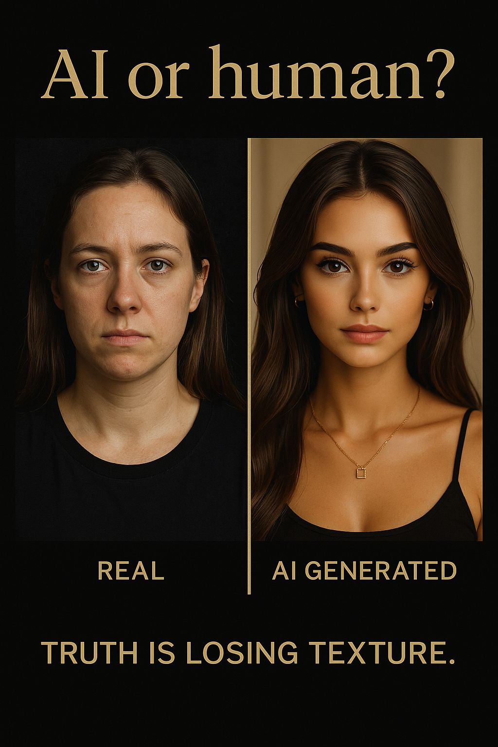
AI or Human?
Truth is losing texture — a commentary on artificial beauty and visual deception in the age of generative imagery.
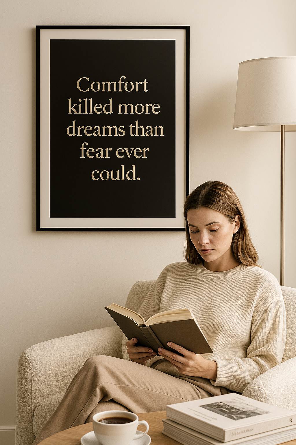
“Comfort killed more dreams than fear ever could.”
A visual on silent self-sabotage — exploring the human tendency to choose comfort over change.
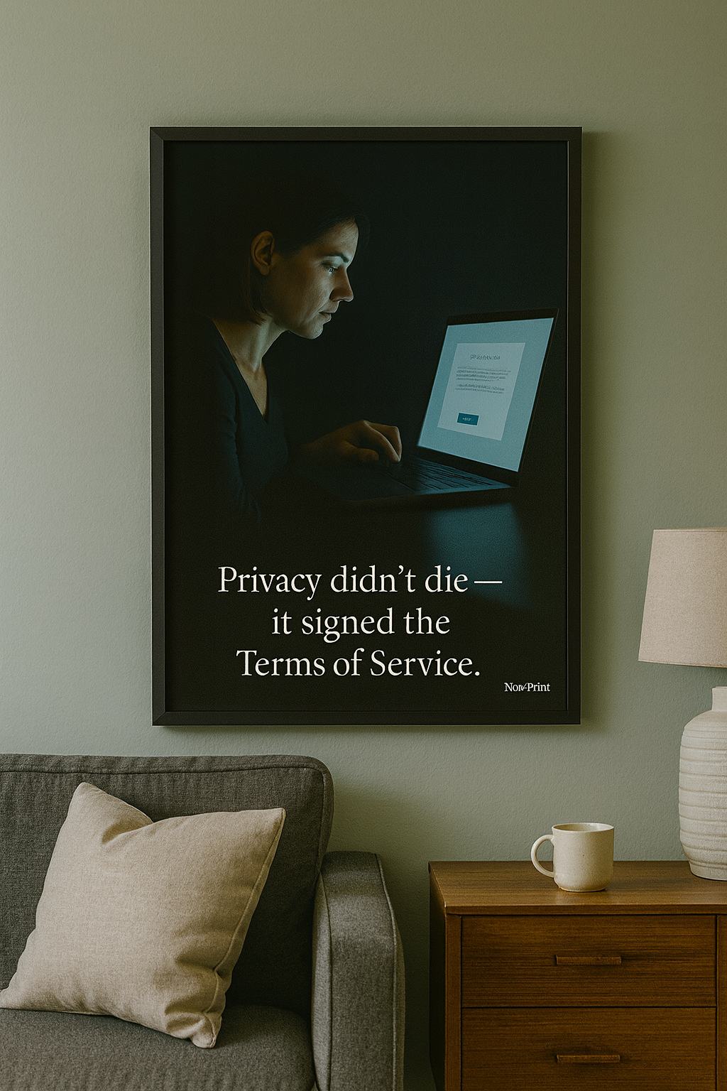
“Privacy didn’t die — it signed the Terms of Service.”
An ironic observation on voluntary digital exposure and the illusion of consent in the online era.
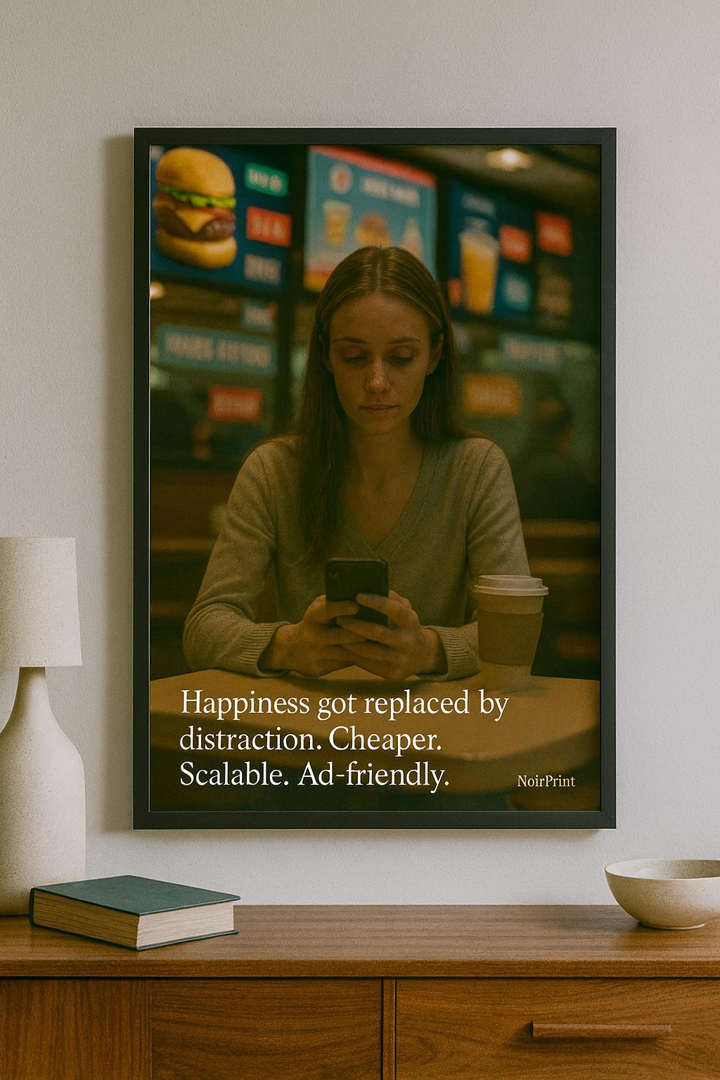
“Happiness got replaced by distraction.”
Cheaper, scalable, ad-friendly — a modern parody of dopamine economy and algorithmic comfort.
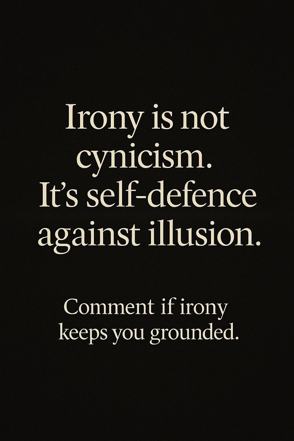
“Irony is not cynicism. It’s self‑defence against illusion.”
The core ethos of NoirPrint — reflection through wit and restraint, rendered in timeless typography.

“We became reflections of our own noise.”
A symbolic study of digital identity — blurred, luminous, and quietly vanishing in self-reference.
What is NoirPrint?
NoirPrint is a study in visual honesty. We pair classical type with documentary realism, crafting pieces that feel both contemporary and timeless. Every line aims to be reread, not scrolled past.
Process
Concept → Copy → Layout in Canva → Photoreal scenes via AI → Typography integration → Final grading. This hybrid workflow keeps the work consistent while leaving room for experimentation.
- Typeface pairing: Playfair Display + Inter
- Palette: Black · Gold · White
- Aspect ratios: 1:1 post, 4:5 print, 9:16 reel